Now that you already know the fundamentals of data acquisition and the basics of data acquisition hardware, let’s move on and start to look at what data traces will look like. To begin this series on analysis of data traces, it’s only fair to look at speed data first. Speed is a channel available even in the most basic data logging systems, and the information it can provide is invaluable. At the end of the day, racing boils down to one single question (“how fast are you?”) and speed data is the most precise answer to this question.
Analysis of data is never done using a single channel. However, when the budget and/or regulations limit the amount of sensors available in the car, a speed data plot is very thorough, in that it provides information on a lot of important aspects of a race car performance. This includes acceleration, braking, chassis performance and tuning, aerodynamic performance and driver behaviour.
The most useful analysis from speed plots comes from comparison between different laps. This can be used to see how a setup or component change affects the performance on a particular sector of the track. It also may be used to assess driver performance on different laps, or between different drivers.
Let’s now have our first look at a race car speed trace, and see what it looks like. Figure 1 shows the Autódromo José Carlos Pace (AKA Autódromo de Interlagos), in Brazil. This is where the Brazilian Grand Prix takes place, and the data presented here will be for laps in this circuit. I chose this track because I am particularly familiar with the circuit, and because it has a lot of types of corners which will ultimately generate a lot of different information on the speed plot.
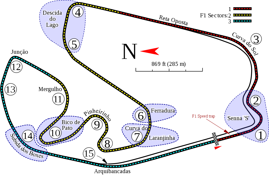
Figure 1. Interlagos circuit layout. (Wikipedia)
Now, let’s have a look at a speed plot at the circuit. The car running is the 2013 Formula One World champion Red Bull RB9. The driver is the same person talking to you now, also known as myself. No, I have never driven a Formula One car, the laps were performed on a commercial racing simulator that can be run on most domestic computers. For more precision on the controls, I used a force feedback steering wheel/pedals set. The data was collected through a plugin that generates a MoTec I2 Pro file, which is a data analysis software that can be downloaded directly from MoTec website for free.
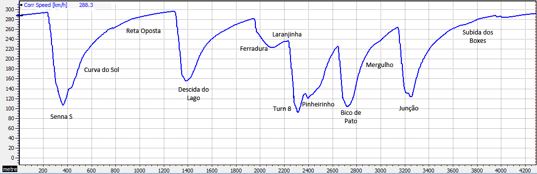
Figure 2. Speed data plot on Interlagos circuit.
Data Interpretation
The graph shows speed plotted in kilometres per hour on the vertical axis. The position of the car on the circuit is shown in metres on the horizontal axis (the plot shown ends at position 4300 m, which is about the length of Interlagos Circuit). Thus, the dips on the graph represent slowing down for corners, while the peaks represent the maximum speeds reached before hitting the brakes.
The lap begins at the extreme left-hand side of the graph. For a real car, the initial point on the graph would be the place where the lap beacon would be positioned on the track, but since there is no lap beacon here, the starting point is the start/finish line.
The graph shows the car accelerating from 288 km/h up, until it slows down for Senna S, as indicated by the downward slope of the graph. The steep negative slope shows that I am hitting the brakes, and you will see later on this lap the difference between this and slowing down by just lifting off the throttle.
From the second corner in the Senna S, I begin accelerating briefly, as indicated by the upward slope on the graph. The short dip at this part of the graph indicates that a lifted off the throttle a little bit. This happened because the car started skidding off in the second leg of the S, so I had to ease a bit to regain control.
The speed keeps increasing now, but at a smaller rate. This happens because aerodynamic drag increases with the square of speed, thus, the acceleration of the car from higher speeds will be smaller. The car keeps accelerating through the Reta Oposta (opposite straight, in English) until it reaches the braking point for Descida do Lago. The steep slowing down to 155 km/h again indicates that heavy braking is being applied.
At this point, I begin accelerating to about 288 km/h, until reaching Ferradura. Here you can see two characteristics downward slopes for this turn. The first, steeper slope represents the brief moment where I hit the brakes and downshift to sixth gear to enter the corner. The second, shallower slope, indicates that I was decelerating either by gently braking or by lifting off the throttle (in this case I was lifting off the throttle).
Laranjinha is a corner made flatout, as indicated by the upward slope before braking for turn 8. After this, it follows a brief acceleration before reducing throttle for Pinheirinho. Next, another moment of acceleration before heavily braking for Bico de Pato, which is travelled at a minimum of 104 km/h.
The fast Mergulho is travelled at g-forces as high as 4 g. After this corner, heavy braking is again applied, in order to prepare to enter into Junção, where a little speed loss shows the car skidding a little bit again. As the car was accelerating to the main straight, I made a mistake and let the car go a little bit of the track at Subida dos Boxes, and that is shown by the dip on the graph at the end of the graph. Yet, this is my fastest lap time ever, at 1:11.999.
This approach of looking at the circuit corner after corner and analysing data section by section is helpful to train you to understand data better. By going through the trace in this manner, you can know where you are on the course, and by getting familiar with the characteristic speed trace shape for the particular track you are visiting, you will be able to analyse and compare laps or runs much quicker.
Data Overlays
Data overlaying is a feature of data analysis softwares that allows data from multiple laps to be superimposed, in order to make a sector-by-sector comparison between different laps. This is where data logging really proves its value, and it is invaluable when analysing how one can improve or how one has improved. Figure 3 shows an overlay of data from two different laps in Interlagos.
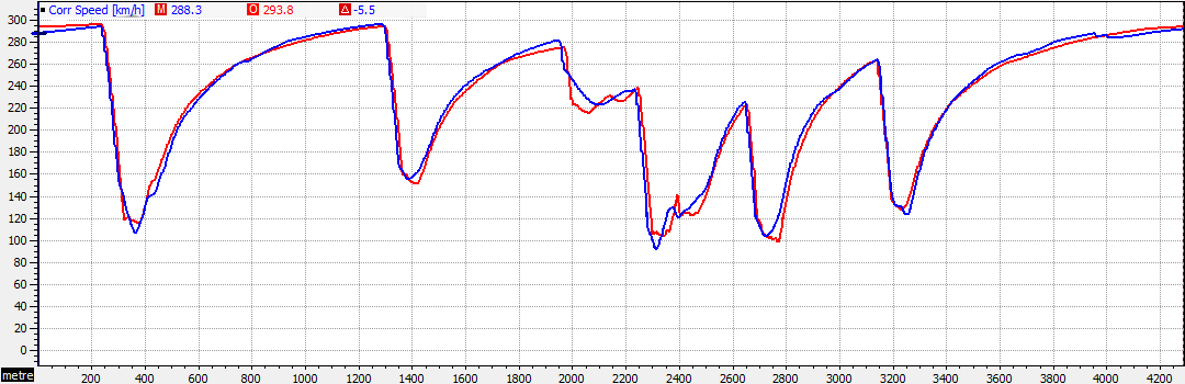
Figure 3. Speed data overlay from two different laps in Interlagos.
The blue line represents my fastest lap at Interlagos with the Red Bull Rb9 as previously analysed. The red line is for a lap with the same car driven by the artificial intelligence bot from the racing simulator that I used to generate this data. At this moment, it is important that you take a look at how the shape of the graphs are quite alike each other. Also, you should notice the points where the speed of the two drivers (me and the bot) is almost the same and the points where there is significant difference between the two. For example, at the beginning of the lap, the data shows that the bot is 5.5 km/h faster than me (“The bot is faster than you!” 😛 ). Now let’s have a sector-by-sector look comparing the two laps, similarly as we did before.
The lap begins with me being slower than the bot at the main straight of the circuit, which is inherited from making a mistake at Subida dos Boxes on the lap before, which cost me a few kilometres per hour.
At the braking stage before Senna S, me and the bot started to apply the brakes at about the same point on the track, and slowed down almost at the same rate, as evidenced by the equal downward slope at this part of the circuit. However, I stopped braking before the bot, and carried out the remaining speed reduction by lifting off the throttle. As the cars entered the corner, I kept slowing down, while the bot tried to keep the speed somewhat constant, and that cost me a 9.8 km/h difference at the turn 1 apex, as the bot leaves it at 116.2 km/h.
We then start accelerating from turn 2 towards Curva do Sol. You can see that the bot can make a much smoother transition from the first leg to the second of Senna S than me. This gives the bot a small speed advantage at the apex of the corner.
From the exit of Curva do Sol to the Reta Oposta, I am able to accelerate faster than the bot but the difference is very small. The bot and me again brake at the same spot to enter the first corner of Descida do Lago (turn 4), and again we have about the same deceleration rate, but this time, I let off the brakes earlier. Because of that, I was able to carry much more speed through the corner and ended up 11.6 km/h faster, as I left at 163.0 km/h.
We now accelerate towards Ferradura, with me being able to achieve a 6.7 km/h advantage over the bot. At this corner, I started braking earlier than the bot, with me hitting the brakes for a brief period, and slowing down to the corner entry by lifting off the throttle. This gave me a speed advantage of 15.3 km/h (eat that, bot!) at the apex of the corner, as I travelled at 233.1 km/h. At Laranjinha, for a brief moment the bot regains speed and is able to go faster than me before we start braking for turn 8. Right before the braking point, I am faster than the bot again.
When preparing for turn 8, I started to brake earlier, but applied the brakes for a longer period, which gave the bot a 16.0 km/h advantage at the apex, with the bot going through it at 107.7 km/h. We then start accelerating again, before reaching Pinheirinho. Notice that, while the bot achieves a higher speed before the corner entry, he needs to brake in order to keep the car in control, while I just lift off throttle for the corner entry, while keep constant throttle through the corner. This gives me a 11.6 km/h advantage at the apex of Pinheirinho.
We then accelerate towards the entry of Bico de Pato. For this time, I started braking for a shorter period than the bot, and was able to achieve a 8.3 km/h advantage at the exit of the corner. We now accelerate through Mergulho at about 4.5 g of lateral force, with me lifting off the throttle a little bit and the bot going flat-out.
For Junção, I again start to brake at the same spot as the bot, and some instabilities at the exit of the corner made me lift off again, giving me a 20.1 km/h penalty in relation to the bot. The cars accelerate to the main straight, and as you saw before, I went a little bit off the track at Subida dos Boxes, and that cost me another few kilometres per hour at the end of the lap. For this lap, the bot scored a 1:11.326 time, 0.673 faster than my fastest lap on the circuit (I really need to practice more).
Did you see how much information you can get by looking at different laps speed plots together? Unfortunately, these comparisons may rise as many questions as they can answer. There might be some temptation to answer those questions in a speculative manner, but this could be right answer or it could be way wrong. Therefore, you shouldn’t rush to provide the answers – just take a note of the questions initially, analyse other channels to see what additional info they can provide and then repeat those questions to the driver during the debriefing. This will help you to learn much more than trying to provide conjectural and possibly completely wrong answers.
On the next posts on Data Acquisition, I will talk about some useful tools available to the data engineer, when analysing either driver or vehicle behaviour. You don’t want to miss that, do you? Then, please keep in touch with Racing Car Dynamics, by subscribing to our list below. See you on the next articles!
 KEEP UP TO DATE